Oracle APEX Template Components with Web Components #JoelKallmanDay
I already blogged about how to create the new template component plug-in type from Oracle APEX 23.1
. I recommend reading this if you are looking to create simple HTML templates without complex JavaScript logic.
In this post, I want to showcase how to create more complex, JavaScript-heavy template components.
The
Template Component Plugin Challenge
is still open until the end of October 2023. You can win great prizes. If you are interested in creating your own template component plug-in, you should check it out.
The issues
#I have two issues with normal template component development. Note that these are subjective and, from my view, not easily fixable by the APEX development team.
Dev experience
#My first issue is that it can be frustrating to design your component in the APEX plug-in builder. For minor changes, you have to navigate through the plug-in settings, where you have to wait for page loads for every child page. And even if you just want to quickly adapt some HTML, you have to click save, move to the tab where the component is used, refresh the page and then check the result. This can be slow and frustrating if you are testing a few minor adjustments.
Onload JavaScript hell
#The second issue is how you are forced to think about your logic. The plug-in builder allows you to load JavaScript files that run on page load. If you’d like to, e.g., hide something if a button is clicked, you then have to attach event listeners to every button when the page loads. So you have to think about selectors that match your button (and only your button). Additionally, you need to think about pagination, which causes the old buttons to disappear and new ones to be created.
This is quite complex and gets worse when you then want to run your action. You only wish to hide the region of the row where the button was clicked, not all or any others. Two solutions could be to implement some unique identifiers in the HTML or use something like jQuery closest to find the right one. Both work, but I really don’t like this approach. In modern web development, you think in components where you can add event listeners directly where you define the HTML and reference the elements of that same instance. I think this approach makes way more sense and is easier to understand.
The solution: Web Components
#If you are not familiar with web components, you can read about what they are and how they work in my introductory blog post about them. The most important part about them is that you can separate your concerns.
We can first focus on making the component look and function right, and after that, we can focus on integrating it into APEX. This is possible because web components are self-contained. They don’t need any external dependencies and can be used in any modern browser. This means we can develop them in isolation and then integrate them into APEX.
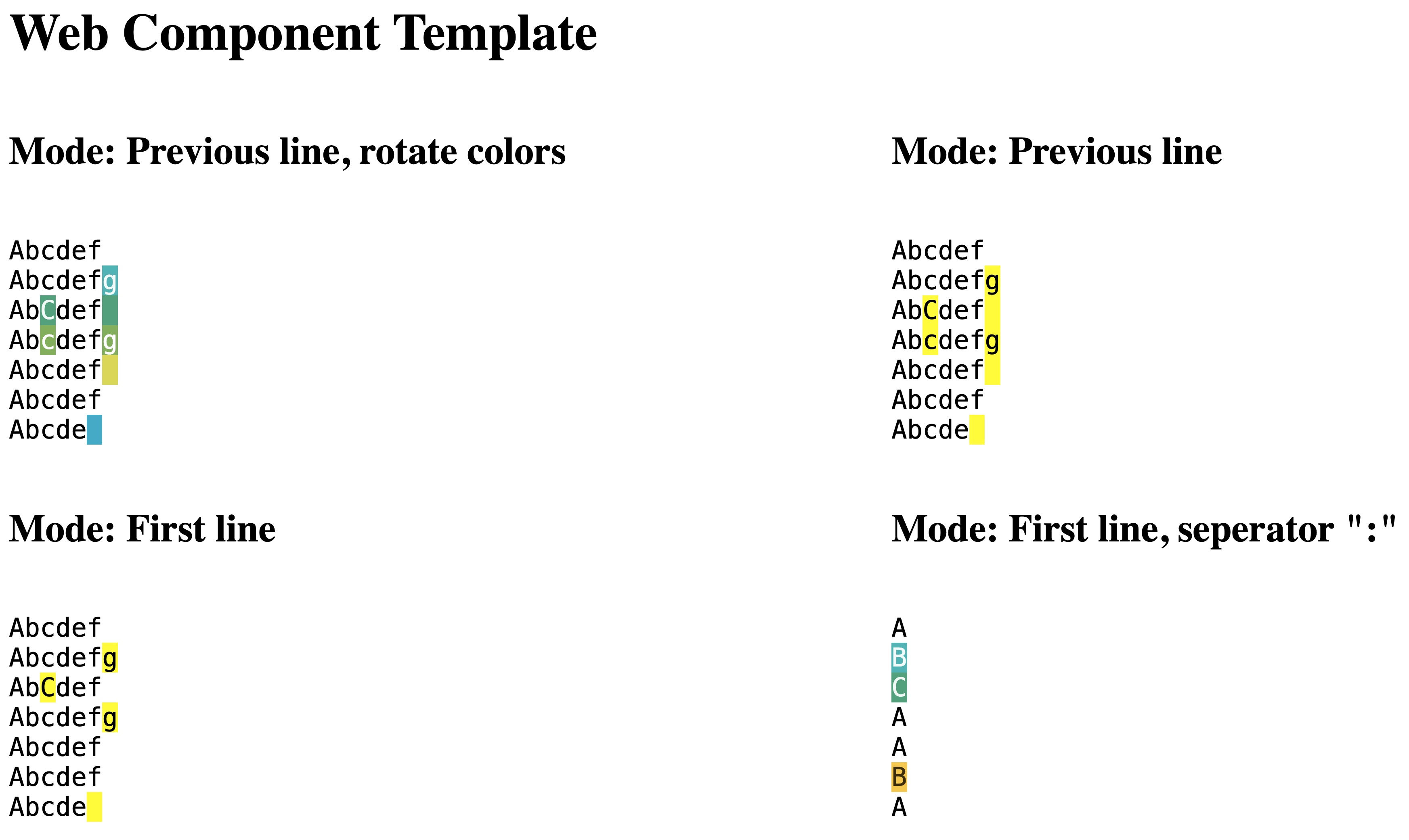
For this blog post, I will create a template component that simply compares strings. I will not go into details on how to code the component itself. If you are interested in that, you can check out the source code on GitHub. Trust me, it is not complex; most of it is actually generated by a ChatGPT prompt:
Create a vanilla js web-component called "x-str-compare-tc". It should highlight differences between multiple input strings.

It receives the strings with data html elements like this:
<x-str-compare-tc>
  <data>Abcdef</data>
  <data>Abcdefg</data>
  <data>AbCdef</data>
</x-str-compare-tc>

It should have multiple parameters:

- First one defines if it does the comparison only against the first entry or every string to the previous one. The parameter should be caled "compare-mode" with the options "first-line"  and "previous-line".

- Second one should be a boolean called "rotate-colors". When this is true it should change the highlight color of every line rotating from css vars --u-color-1 to --u-color-13 starting again from 1.

- Third one is a seperator char. If it is not empty the text in the data tags should be split by the seperator into multiple ones.
I pasted the code into my GitHub Web Component template, where I can start a development server and test the component. When I change anything in the code, the browser will automatically reload, and I can see the changes. This is a huge improvement over the APEX plug-in builder. This is how my dev site looks when I test the component with different settings:
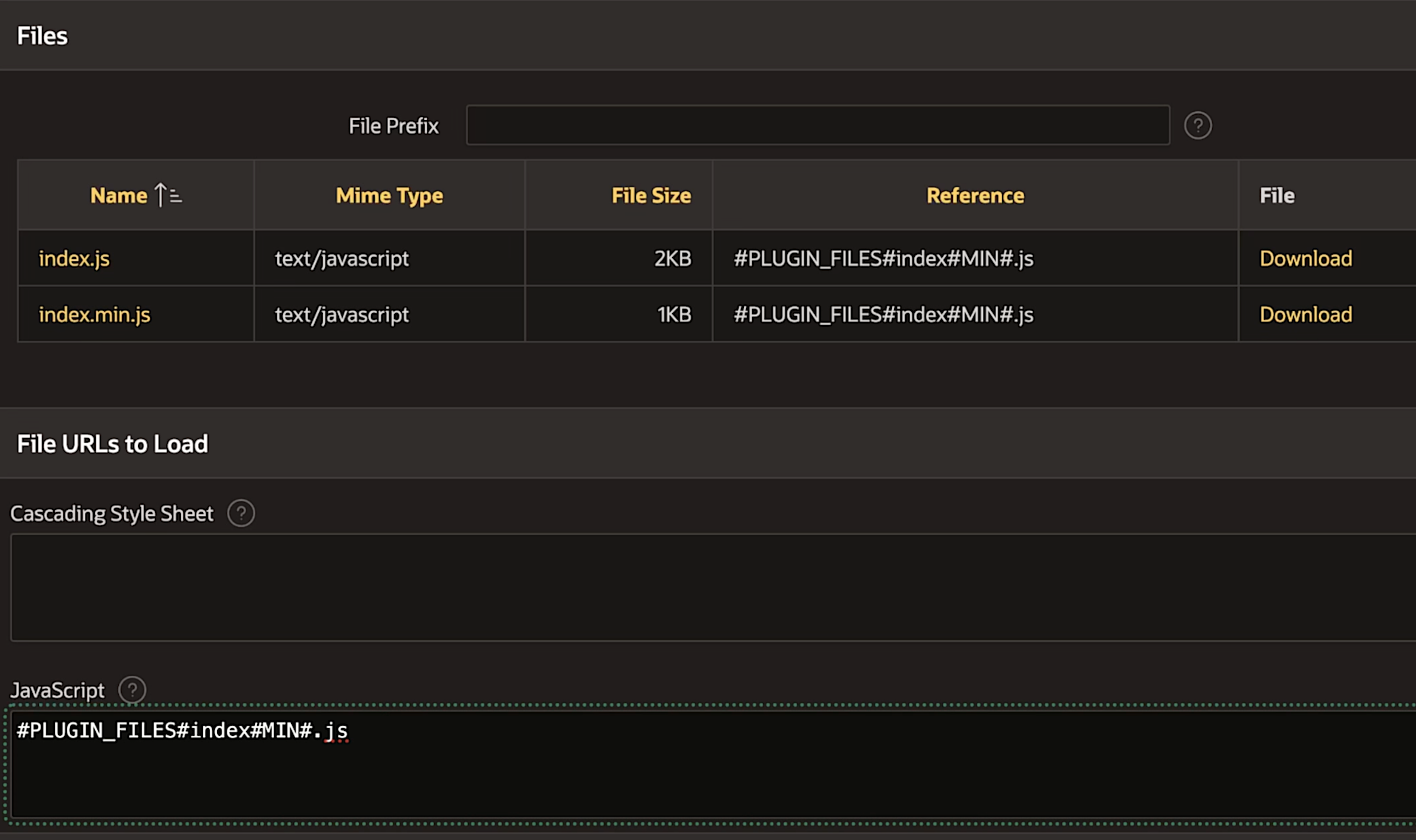
When I am done, I run the build script, which results in a normal and a minified JavaScript file.
Integrating the component into APEX
#First results
#The first thing we need to do is head into the shared components of an app and create a new plug-in of the type “Template Component”. We can then upload the JavaScript files we created in the previous step.
Remember the ChatGPT prompt where I described the HTML structure?
<x-str-compare-tc>
  <data>Abcdef</data>
  <data>Abcdefg</data>
  <data>AbCdef</data>
</x-str-compare-tc>
This is straightforward to replicate in the APEX settings. First, we focus on making this work in multiple (report) mode. Each row of the query should return a string we want to compare. We pass the string in the data elements. That’s why we can just put the tag with a text placeholder into the “Partial” field:
<data>#TEXT#</data>For the “Report Body” input, we can use our web component wrapper and the APEX rows placeholder:
<x-str-compare-tc>#APEX$ROWS#</x-str-compare-tc>As we are done rendering our desired HTML structure, we can leave “Report Row” empty.
To make the TEXT placeholder work, we need to create a custom attribute inside the plug-in builder:

We make sure the static ID says “TEXT”, required is on, and only “varchar2” is selected as an allowed data type.
Next, we can save our plug-in, head to any page, and create a region of the plug-in type. We can now enter any query that returns a column of strings and assign it to the TEXT attribute. We should now see the component working.
Web Component Attributes
#We still need to make the other attributes like compare-mode and rotate-colors work. For this, we have to create two more attributes in the plug-in builder. We can do this by clicking the “Add Attribute” button again. We create one called COMPARE_MODE, set the scope to “Report” as the setting should be global and not decided per row-level. Furthermore, we set the type to “Select List” and define the two options “first-line” and “previous-line”. We also set the default value to “first-line”.
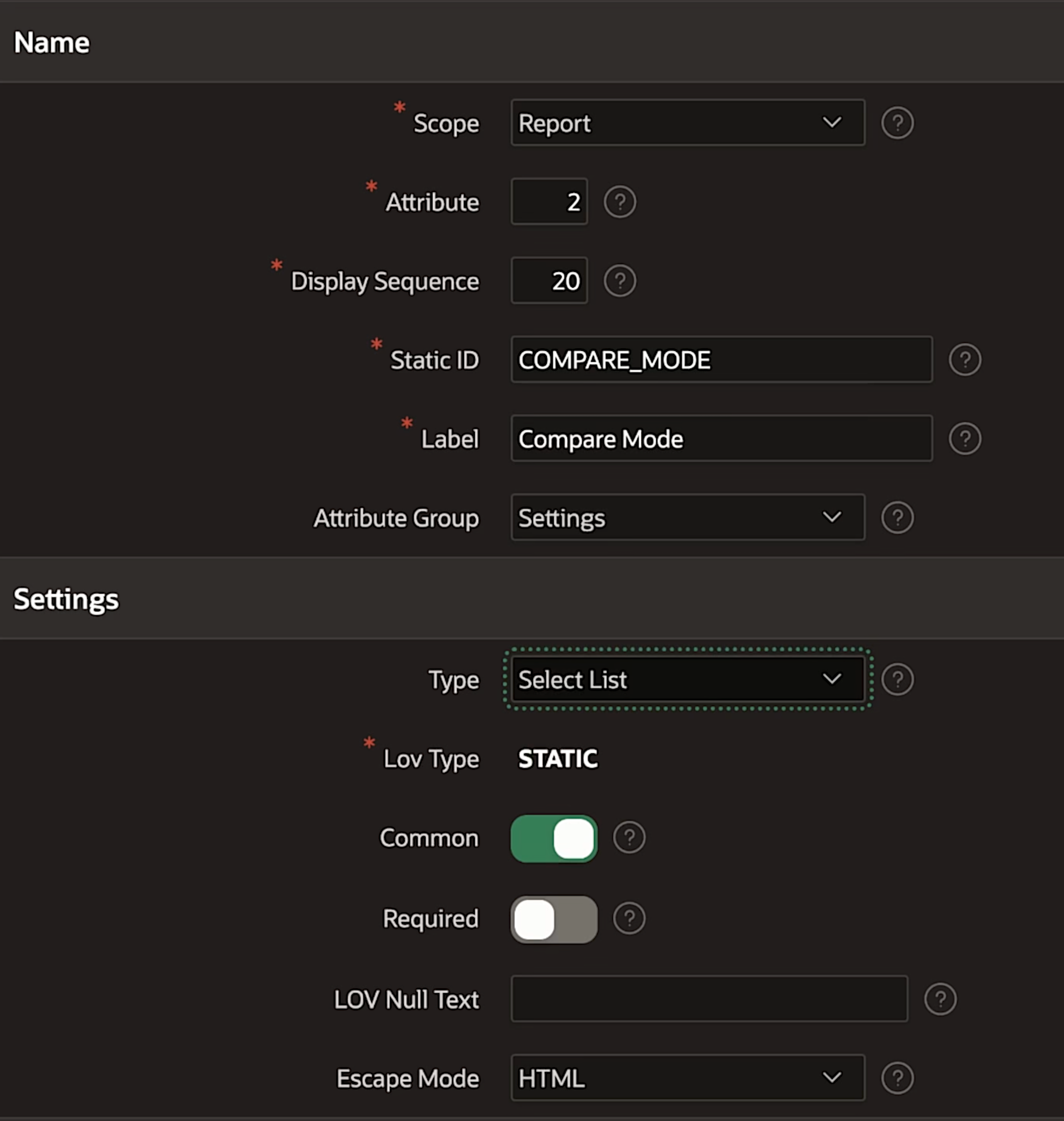
We can repeat the same procedure for the ROTATE_COLORS attribute. We set the scope to “Report” again and the type to “Yes/No”.
Now we can set the attributes values in the “Report Body” input where we defined our Web Component call. We can just pass the COMPARE_MODE placeholder and for the ROTATE_COLORS attribute we need to use template condition as we want to pass true/false instead of Y/N:
<x-str-compare-tc
  compare-mode="#COMPARE_MODE#"
  rotate-colors="{if ROTATE_COLORS/}true{else/}false{endif/}"
>
  #APEX$ROWS#
</x-str-compare-tc>
We can again save the plug-in and head to any page to test it and see that it works.
Partial mode
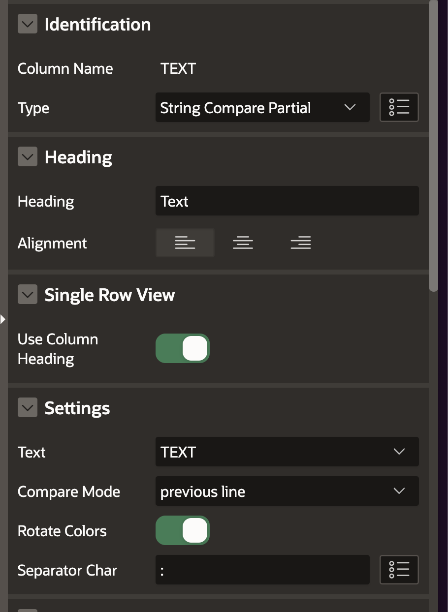
#What if we aim to use the component inside a report column? To achieve that, we should just enable the partial setting in the plug-in. Unfortunately, this does not work in our case. We build the web component in such a way that we have the <x-str-compare-tc> element as a wrapper around the <data> elements. In partial mode, only the partial HTML template is rendered. This means we only have the <data>#TEXT#</data> part and are missing our custom wrapper.
To fix this, we need to actually create a copy of the plug-in. For that, just head to plug-ins in the shared components and click “Create” again. Now we can select to create one as a copy of an existing one. We select our “String Compare” plug-in and give it a new name, like “String Compare Partial”.
In the copy, we need to first modify the template. We only need to fill the “Partial” part, and in there wrap the existing <data> tag in our custom element:
<x-str-compare-tc
  compare-mode="#COMPARE_MODE#"
  rotate-colors="{if ROTATE_COLORS/}true{else /}false{endif/}"
>
  <data>#TEXT#</data>
</x-str-compare-tc>
We need to additionally head into each attribute of the scope “Report” and change it to “Component”. The “Report” scope only exists for components in “Multiple (Report)” mode. Finally, we can change the plug-in mode from “Multiple (Report)” to “Single (Partial)“.
A string comparison needs at least two strings. Luckily, we added the separator-char attribute to our web component. To enable it, we need to add it to the “Partial” template:
<x-str-compare-tc
  compare-mode="#COMPARE_MODE#"
  rotate-colors="{if ROTATE_COLORS/}true{else /}false{endif/}"
  {if SEPARATOR_CHAR/}separator-char="#SEPARATOR_CHAR#"{endif/}
>
  <data>#TEXT#</data>
</x-str-compare-tc>
Additionally, we create another attribute SEPARATOR_CHAR that is of type “Text” and define a maximum length of 1.
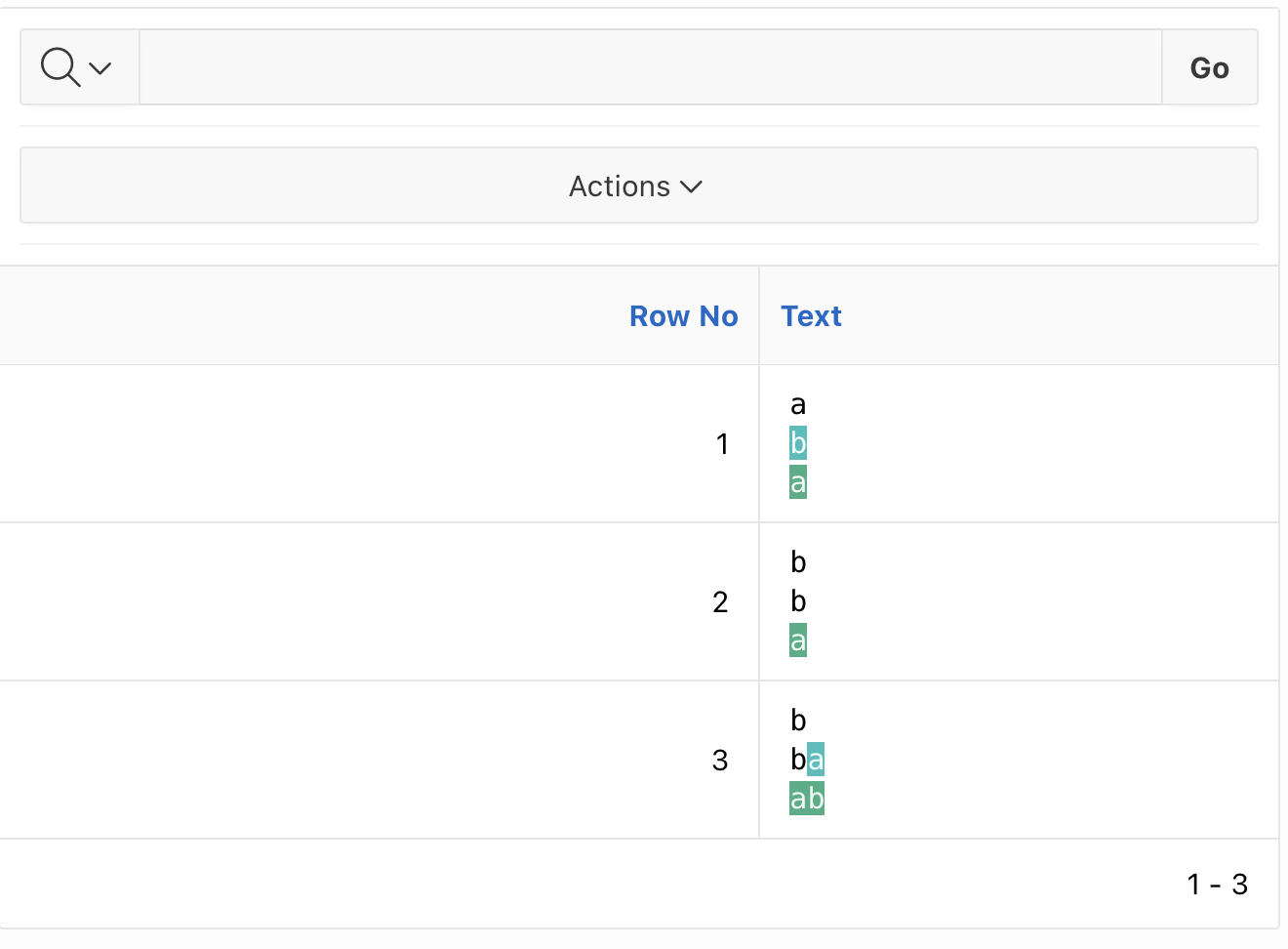
Now we can head to our test page, create an interactive report, and use listagg to create a separated string of multiple values. For my quick demo, I just mocked the string:
select 1 as row_no, 'a:b:a' as text from dual
union
select 2 as row_no, 'b:b:a' as text from dual
union
select 3 as row_no, 'b:ba:ab' as text from dual
If we head to our “text” column, we can change the type to our template component. In there, we can set all the attributes as we were used to with the report mode.
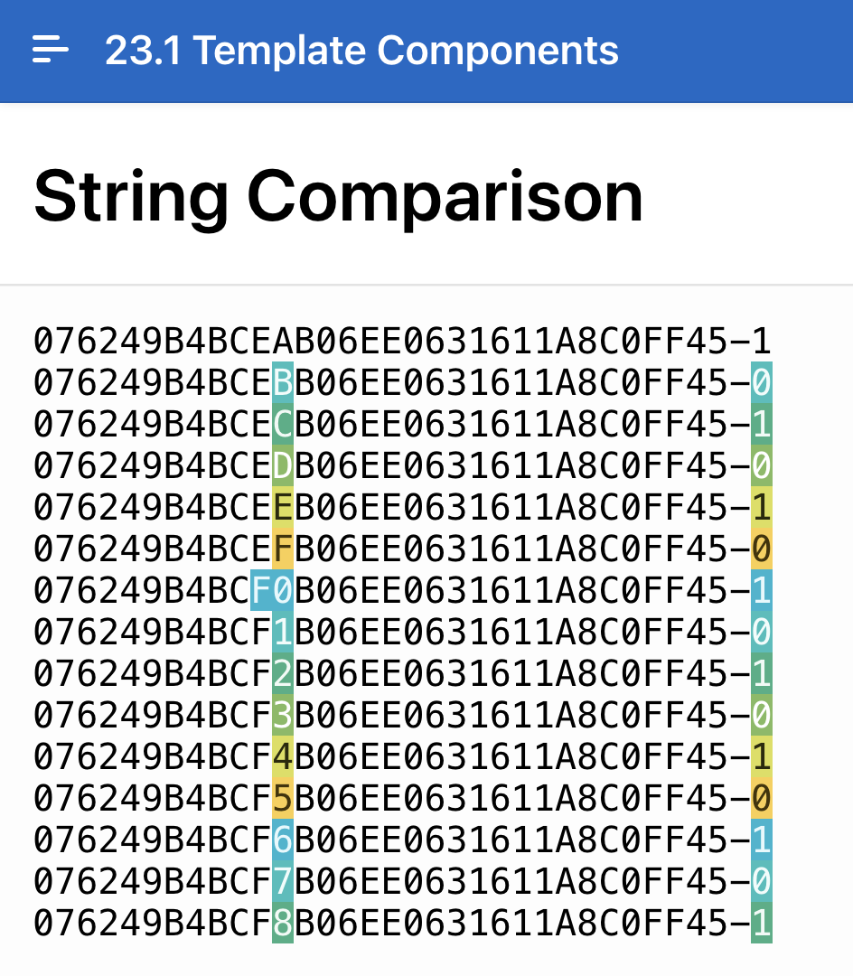
The result looks like the following:
Template Component Challenge
#If you feel inspired to create your own plug-ins, please enter the Template Component Plugin Challenge. You just need to submit any Template Component plug-in you created to get a chance of winning nice prizes. We have a great jury that will judge the plug-ins. The deadline is October 31, 2023.