
Introduction to Template Components in Oracle APEX 23.1
If you’re looking for a more visual and interactive way to learn about the topic of this post, check out
my YouTube video on the same subject
.
23.1 is here!
#Today, Oracle deployed APEX 23.1 on https://apex.oracle.com . It has many great new features and improvements, but the one that I am most excited about is Template Components. I attended a Keynote at APEX World 2023 where Menno Hoogendijk presented this feature and I immediately knew this feature has a big impact.
Small Feature with Big Impact
#As far as I know, you can actually do nothing with Template Components you could not do before. But the way you can do it is so much easier that I believe it has a huge impact. Let me explain.
What are Template Components?
#Template Components are a new Plug-In type in APEX. They allow you to define an HTML template (with or without additional CSS and JavaScript) and use placeholders. They are much easier to work with than a full Region Plug-In, where you don’t need in-depth understanding of the Plug-In APIs.
On any page, you can then create a region of that Plug-In type, place a query and then get an instance of that template filled with the data for every row returned. You can also render a single instance in a region or even use them in Interactive Report columns.
Bridging the Gap between Low and High Code
#APEX excels at creating simple data-driven applications. We all use the predefined regions and Universal Theme. It gives us an outstanding development speed boost, but at the cost of customizability. In most cases, you know when you use an APEX application because all kind of look the same. That is just one of the downsides of Low Code.
Template Components is the tool for developers to spend time customizing parts of the UI for apps that deserve the care. They allow us to easily define powerful and custom UI components while still offering a Low Code interface, great developer experience, a lot of flexibility and you can compose them.
Sharing is caring
#As they are Plug-Ins, you can just export them and share them anywhere (preferable on apex.world). I think as developers come up with great components, we will get a wonderful library of UI elements in the next few years.
So, I encourage you to start creating your own Template Components and share them with the community.
Creating the first Template Component
#What to show
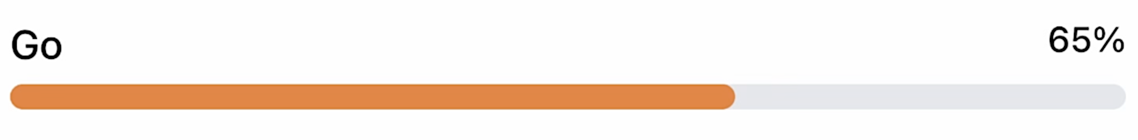
#First, we need to think about what we want to create. I went with a simple example that just renders a progress bar:
The HTML markup is pretty simple. You can ignore all the classes, they utilize the CSS framework Tailwind CSS, which is great for rapid prototyping. I will just copy the generated CSS from the Tailwind CSS playground.
<div class="mb-1 flex justify-between">
  <span class="text-base font-medium">Skill</span>
  <span class="text-sm font-medium">80%</span>
</div>
<div class="h-2.5 w-full rounded-full bg-gray-200">
  <div class="h-2.5 rounded-full" style="width: 80%; background: orange"></div>
</div>
Creating the Plug-In
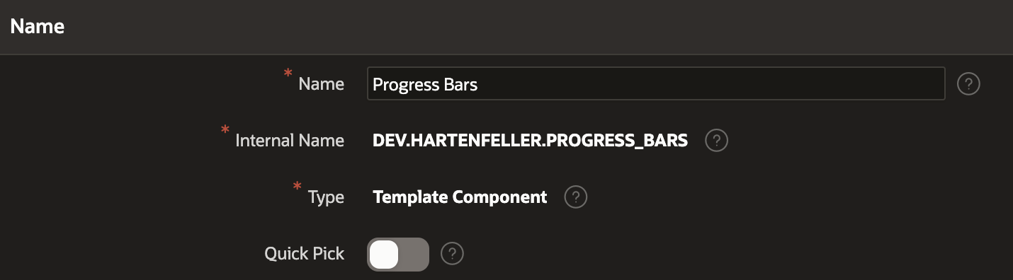
#Now we can create the Plug-In. Head to the Shared Components of any app and create a new Plug-In. I called mine Progress Bars and selected the Template Component type.
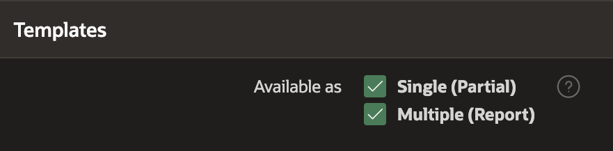
Then you are presented with a checkbox about whether the template is a single instance (Partial) or a list (Report). As I wanted to try out both, I checked both options.
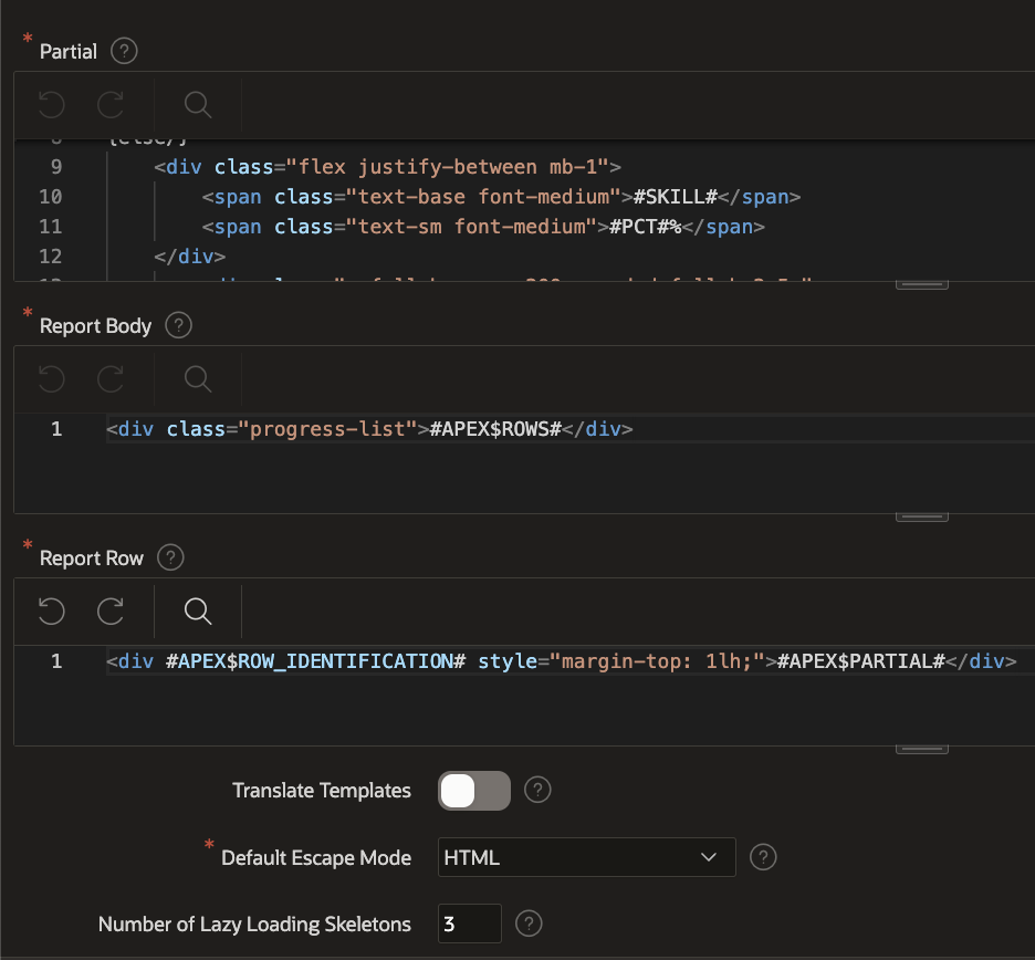
Next up, you can define the Partial template. This is the template that will be used to render a single instance of the component. A default template should be visible that starts with an if condition: {if APEX$IS_LAZY_LOADING/}. You can ignore this part for now, as we will come back to it later, but this indicates that we can use template directives. They are a mighty tool that I won’t go into detail here, but you can check out the documentation on it (currently there is no 23.1 API yet).
I just pasted the HTML from above into the else part. Then I changed all the hard-coded values to placeholders (wrapped in #). I added a placeholder for the label and the percentage. I also added a placeholder for the color of the progress bar. It expects a number between 1 and 45 (the Universal Theme colors) and will use the corresponding color CSS variable. I also implemented a fallback when no color is provided (see the {if COLOR_INDEX%assigned/} part):
{if APEX$IS_LAZY_LOADING/}
<p>loading...</p>
{else/}
<div class="mb-1 flex justify-between">
  <span class="text-base font-medium">#SKILL#</span>
  <span class="text-sm font-medium">#PCT#%</span>
</div>
<div class="h-2.5 w-full rounded-full bg-gray-200 ">
  <div
    class="h-2.5 rounded-full bg-blue-600"
    style="width: #PCT#%; background: {if COLOR_INDEX%assigned/}var(--u-color-#COLOR_INDEX#);{else/}var(--u-color-1);{endif/}"
  ></div>
</div>
{endif/}
In the next code input, you can define the wrapper HTML structure. I changed it from an ul to a div with a class:
<div class="progress-list">#APEX$ROWS#</div>The third code input is the Report Row template. It is the template that will be used to render a single row of the query. I changed the li to a div and added a style attributes:
<div #APEX$ROW_IDENTIFICATION# style="margin-top: 1lh;">#APEX$PARTIAL#</div>Next to the three inputs you could also define translation settings, escaping and lazy loading settings.
I’ve also crafted a styles.css file, incorporating the essential CSS. To load this file, simply include the provided path in the designated input field.
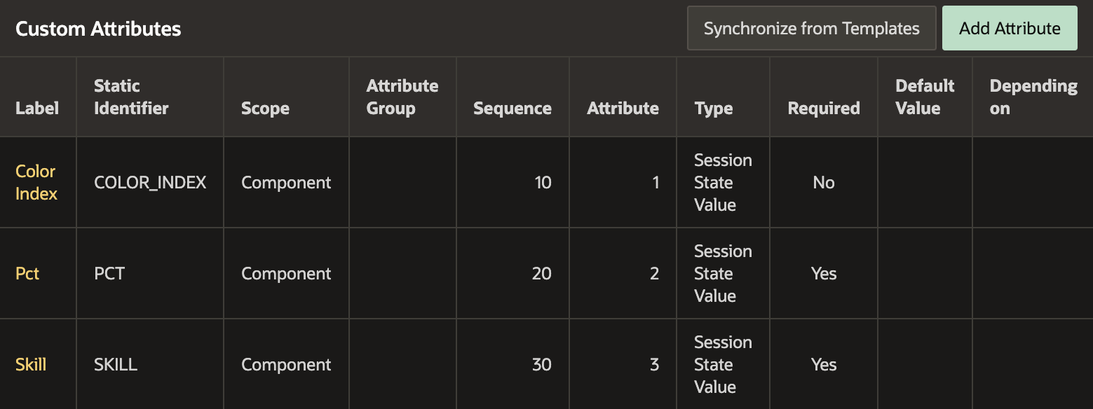
Manage Attributes
#When we then save the Plug-In, APEX will automatically extract all the placeholders and create attributes for them. You can then manage the attributes to define which ones are required, their data type and a default value.
Using the Template Component
#We can now go ahead on any page, create a region and select the Progress Bars template component. After adding a query, we can assign the columns to the placeholders.
SELECT 'JavaScript' as title
     , 90 as skill
     , 1 as i
  FROM dual
 UNION
 SELECT 'SQL'
      , 50
      , 2
   FROM dual
 UNION
  -- ...
 ORDER BY 3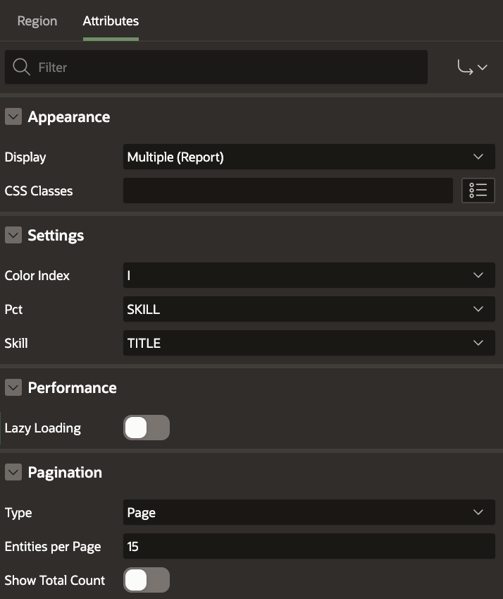
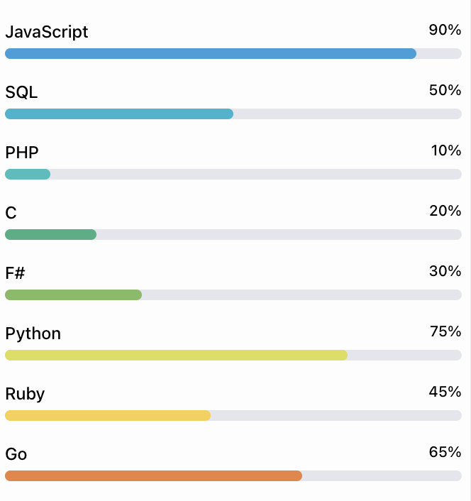
And the result is the following:
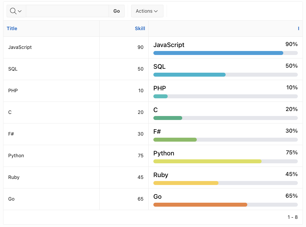
How about an Interactive Report column
#As we checked both boxes in the display as section of the Plug-In, we can also use the template component as an Interactive Report column. I created a new Interactive Report and entered the same query. I then changed the last column that contains the index to the type of my Progress Bars Plug-In. Likewise, I had to assign the columns to the placeholders.
What about Lazy Loading
#In the partial template, we saw that there is a placeholder for lazy loading. We can use this to show a loading indicator that looks like an empty state progress bar. I removed any colors and changed the placeholder values to dots:
{if APEX$IS_LAZY_LOADING/}
<div class="mb-1 flex justify-between">
  <span class="text-base font-medium">..............</span>
  <span class="text-sm font-medium">..%</span>
</div>
<div class="h-2.5 w-full rounded-full bg-gray-200 "></div>
{else/}
<!-- ... -->
{endif/}
If we then go back to the region and enable lazy loading, we will see the following for a short time before the actual data is loaded:
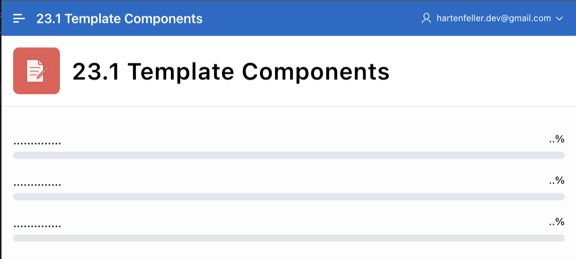
I think this is a neat way to show that something is loading. Unfortunately, the number of skeletons shown has to be defined in the Plug-In settings. This can work out fine if you have a fixed number of rows, but the region will change in height when the data is loaded.
You can download the example Plug-In from GitHub.
Actions for Template Components
#Customers List
#For another example, I created a list of persons. In the sample customers app, the list of customers is currently just a rather boring looking table. I wanted to make it look more exciting and ended up with the following design (I copied from Tailwind UI):
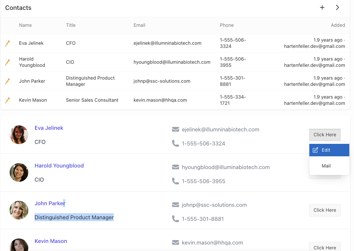
The actions are not defined in the Plug-In
#If you used the Cards Region before, you know that you can define actions there. The same is true for Template Components. When they support Actions you don’t hard-code them into the template, they are defined on the page where it is used. This is a great way to keep the Plug-In reusable.
You can right-click on the actions section and create a new one. Then you can define the action label and position (if your template supports multiple positions). Afterward, you can add single actions into the menu. I added two actions: Edit and Mail. I also added a separator between them.
The edit actions uses the Link Type “Redirect to Page in Application” and passes the ID returned from the query as a parameter. The mail action uses the Link Type “Redirect to URL” and has mailto:&EMAIL. utilizing the &. syntax to reference the EMAIL column.
Defining the actions in the Plug-In
#Before you can actually use the actions, you have to define them in the Plug-In.
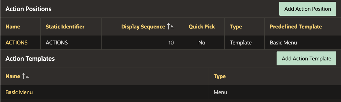
You can first start by creating an Action Template. You can give a name and then choose between the types Menu and Button. I chose Menu and changed the default template to make it look like a default APEX button:
<button class="t-Button" {if IS_DISABLED/}disabled{endif/} type="button" data-menu="#MENU_ID#">
#LABEL#
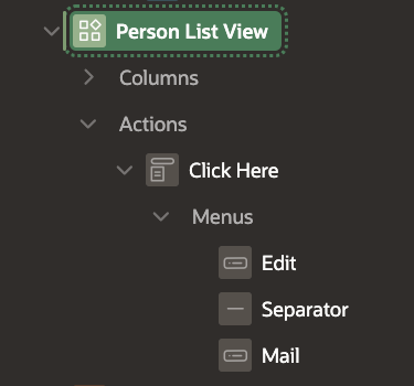
</button> #MENU#Now we can create an Action Position where we can again give a name and an ID. Then we can choose whether the type should be Link or any of our defined Action Templates. I selected the Menu template I created before. Here, we don’t need to define any HTML.
We can now use the Action Position in our template. We can reference it via the ID we defined. I added the following to the partial template at the desired position:
<!-- ... -->
<div>{if APEX$HAS_ACTION_BUTTONS/} #ACTIONS# {endif/}</div>
<!-- ... -->
This is already it. We could define different Action Positions and Action Templates and by that allow the user to control where what kind of action is shown.
Conclusion
#I am a big fan of Template Components. They are a great way to create reusable components that can be used in different places. I hope we will see many creative Plug-Ins in the future. The only thing that makes me sad is that I will not be able to use them in projects that need to be downwards compatible, like LCT :/ .
You can download my example Plug-Ins from GitHub.