How to change the default tap highlight color for Chrome mobile

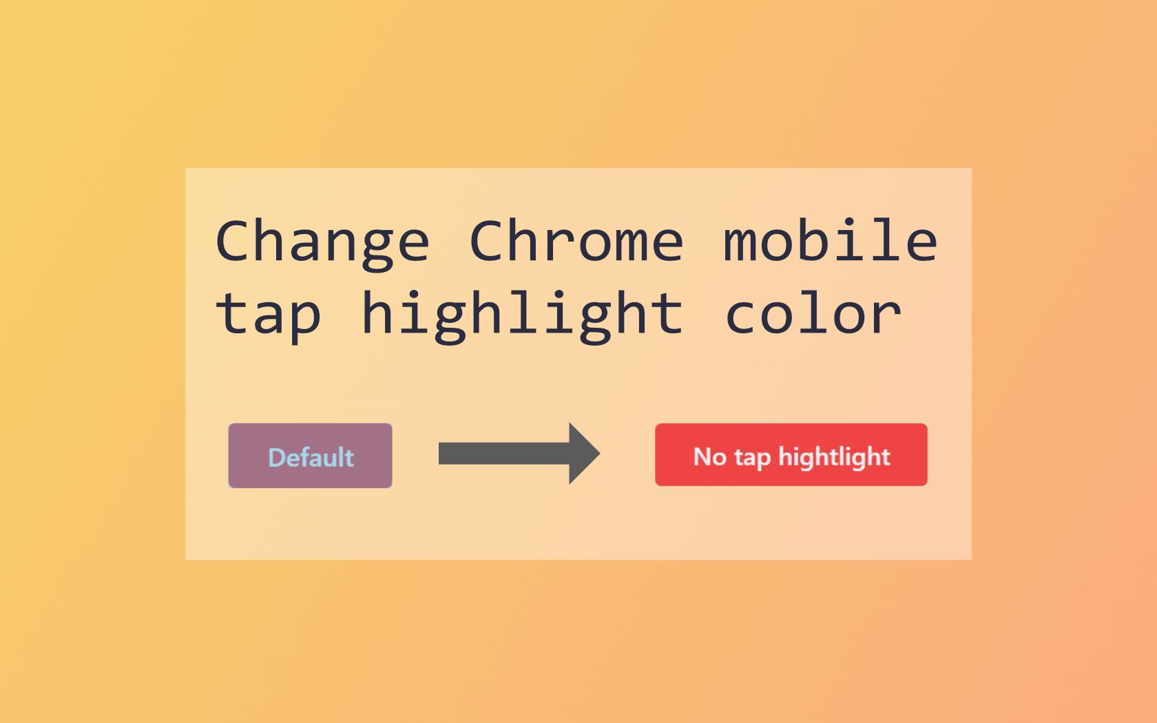
The picture above shows the default blue overlay which is always displayed if the user taps a clickable element. While this feature is useful to give a click feedback, it can destroy your well-thought design. Additionally hover styles are already shown when a user clicks something too. So when you designed your buttons and links with custom hover styles that fit more into your design, you don’t really need this feature.
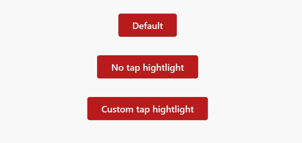
The tap highlight styles can be changed with a simple CSS rule. The custom property -webkit-tap-highlight-color can be changed to a specific color. The feature can be disabled completely with the color transparent. When you want to use a custom color keep in mind that it needs some transparency to still make the text readable. Otherwise, it would just overlay the element.
Examples
#html {
-webkit-tap-highlight-color: transparent;
}
.custom-tap-highlight {
-webkit-tap-highlight-color: rgba(255, 187, 0, 0.5);
}You don’t have to use a phone to test the styles. Instead, you can use the Device Toolbar in the dev tool and simulate a phone with touch controls.