
APEX 20.2: improve Dropzone UX with CSS
As a longtime user of the great Dropzone Plug-In by Daniel Hochleitner, I am entirely happy that APEX 20.2 brought us an own Dropzone option for the File Browser item and we don’t have to use a Plug-In any more.
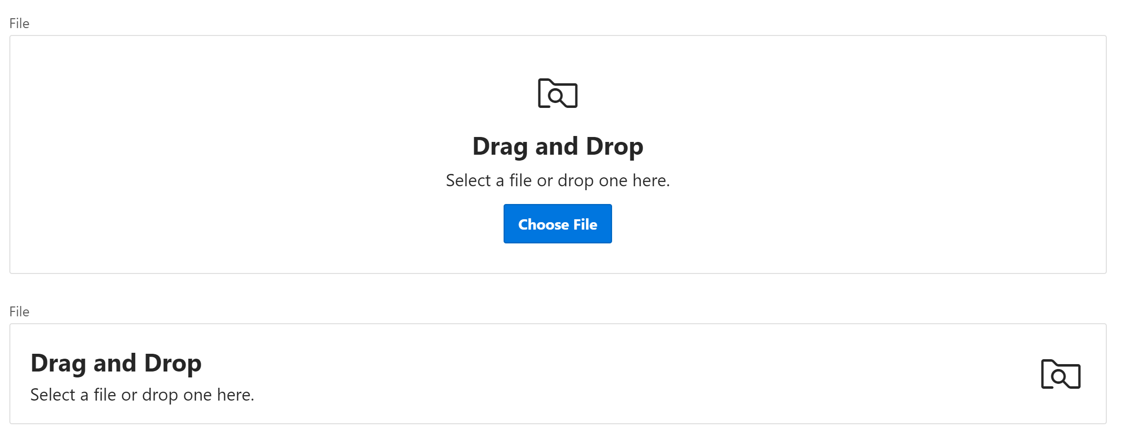
After taking a closer look at the new component, I noticed that somehow it does not look like you can drop a file into there. It just looks like a basic APEX region but does not stand out for its use. The text says you can drop a file there, but with the Plug-In, I subconsciously knew you could without reading the info.
I googled pictures of typical Dropzones and noticed that most ones have a dashed border and stand out from the rest of the page contents. I applied a dashed border to the APEX Dropzone and darkened the background a little bit to make it stand out. I also rounded the border, added some shadow, and changed the border color when a file gets hovered over the region. You can see the results in the following GIF:
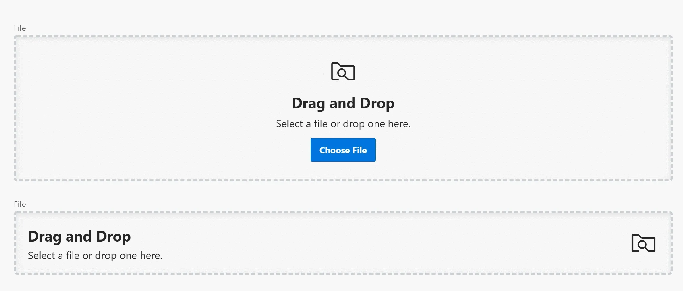
I think this improves the UX of the Dropzone and looks as great as the Plug-In does. Below are the few lines of CSS that you can use and of course tweak the way you like.