

The APEX Slideover Plug-In
=== Update ===
With release 21.2 Slideovers (or Drawers) are now natively included within APEX making this Plug-In obsolete. An example is in the Universal Theme App.
My Plug-In will now enter maintenance mode. Please migrate to the APEX included solution when you can.
==============
I am proud to share my first public Oracle APEX Plug-In. You can download it on GitHub.
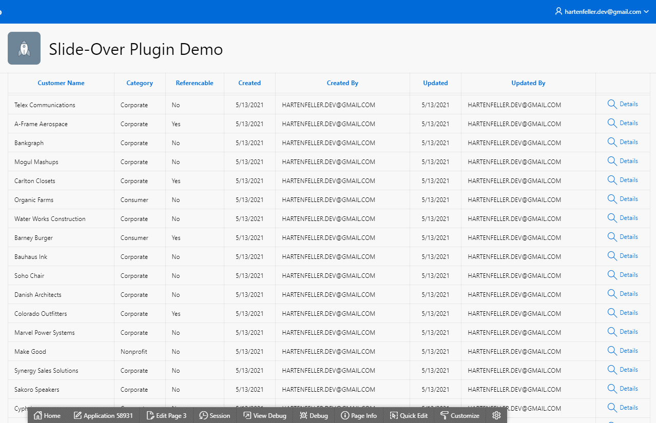
The Demo is available here.
The Slideover Plug-In is a region Plug-In that is by default hidden and slides in from the side when opened. It can slide in from both sides and uses the user-configured Universal Theme styles for APEX Version 21.1. The minimum APEX version to use this Plug-In is 19.2. For more details take a look at the GitHub Page.
How to use
#- Create a region of the type “Slideover [Plug-In]”
- Change Layout -> Position to “Inline Dialogs”
Body1 - Put your desired child regions into the created Plug-In region
- Change settings under the region attributes (optional)
Open a Region
#To open the region create a Dynamic Action with the Action “Open Region”. Then select the Plug-In region.
Or with JavaScript:
1apex.region('regionStaticID').open();
2apex.region('regionStaticID').close();
3
Configuration
#The Plug-In features three attributes that can be configured. You can set a title, change the direction from which side the Slideover will open, and set a width of the Slideover.
Change title
#You can use JavaScript to change the title of the Slideover dynamically.
The initial ital title can be set in the APEX Page Designer in the Attributes. If you want to change it afterward you can call setTitle on the region:
1apex.region('regionStaticID').setTitle('New Title');
2
Change Styles
#For APEX 21.1 it uses the CSS variables by universal theme. The slideover will fit nicely into your app.
You can also style the Slideover with custom CSS:
1/* Dark background to draw attention to the slideover */
2slide-over::part(lay-over) {
3  background-color: rgba(90, 41, 41, 0.6);
4}
5
6/* The layover itself */
7slide-over::part(slide-over) {
8  background-color: #ffffd2;
9}
10
11/* Header of the layover */
12slide-over::part(slide-header-text) {
13  font-weight: 300;
14  color: purple;
15}
16
17/* Close button */
18slide-over::part(close-button) {
19  color: purple;
20}
21
22/* Set close button focus outline */
23slide-over::part(close-button):focus {
24  border-color: pink;
25}
26
Video Tutorial
#Updates
#Download the lastest version here.
Version 1.2
#- Bugfix: The Slideover Web Component now gets appended into the form (wwvFlowForm) instead of the body. There was an issue where Date-Pickers in the Slideover caused strange JS issues
- Slideover Web Components now have a unique ID for better referencing
- New API to change the Slideover title with JavaScript:
apex.region('staticId').setTitle('New Title');
Version 1.1
#In version 1.1 it is now possible (and I recommend doing so) to put the Slideover region inside the “Inline Dialogs” section instead of “Body1”.
There was an issue with Faceted Search Regions where the Slideover content was visible for a short time on page load. Putting the Slideover into the “Inline Dialogs” section fixes this because the content is hidden by default.