
Oracle APEX 24.1 Template Component Improvements
Oracle APEX 24.1 was released yesterday with enhancements to Template Components. I think that Template Components are one of the most impactful additions to APEX in recent times. They allow you to create custom and reusable components that can be shared across applications. Just take a look at the plug-in section of apex.world to see the variety of things they allow us to do.
TL;DR: Slots allow you to put any other region, item or button inside your template component. Selection support allows you to add checkboxes to your template component and let users select rows.
Region-only Template Components
#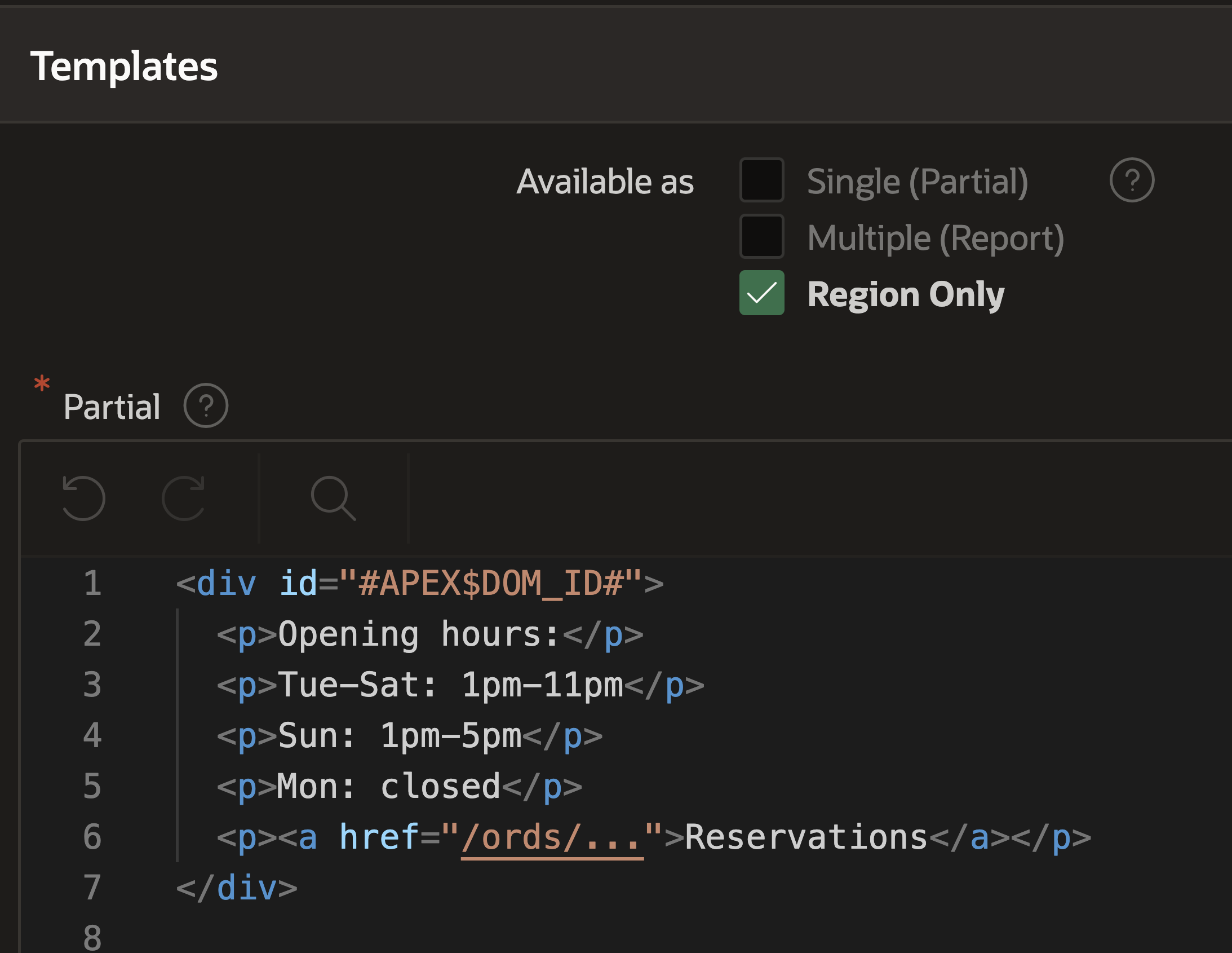
Region only is a new option for the “Available as” attribute. Note that you can’t check “Region only” and “Single” or “Multiple” at the same time.
The difference to “Single” is that you don’t need to provide a query and that there will be no wrapping of HTML elements around the template. The documentation states:
When checked, the Template Component can be used as a region showing static values. The provided HTML template is displayed without any wrapping HTML elements around it. The region has a limited number of attributes in Page Designer (excludes Region Template, Header text, Footer text).
I currently see three use cases for this new type:
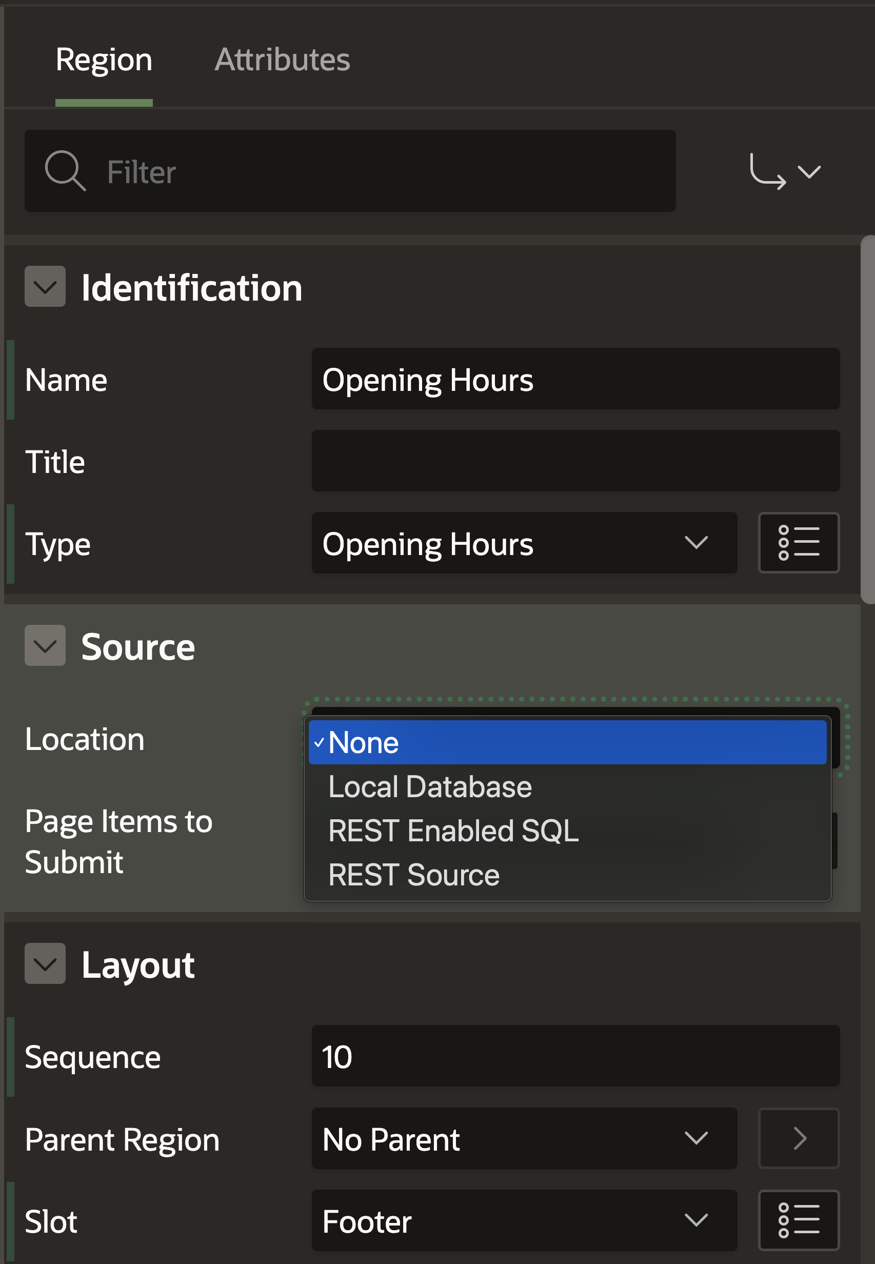
Use Case 1: Static Content
#Any text, images, links, etc. you want to display on some pages. For example, styled opening hours, contact information, etc. As it is formatted or styled, Text Messages can’t be used, and the old solution of creating a page template that includes this information is not flexible.
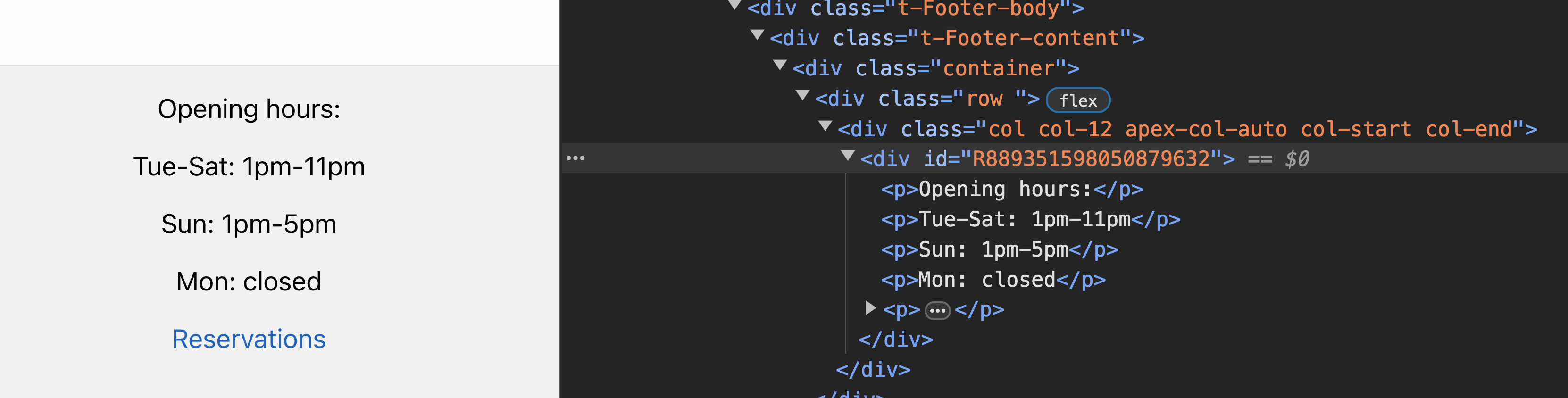
Notice how we now have a new #APEX$DOM_ID# attribute? As the region-only template component doesn’t render any wrapping HTML elements, you can place the identifier inside your template to reference the region in JavaScript or CSS.
In the Page Designer, the source is set to “None”. Interestingly, we could still provide a source.
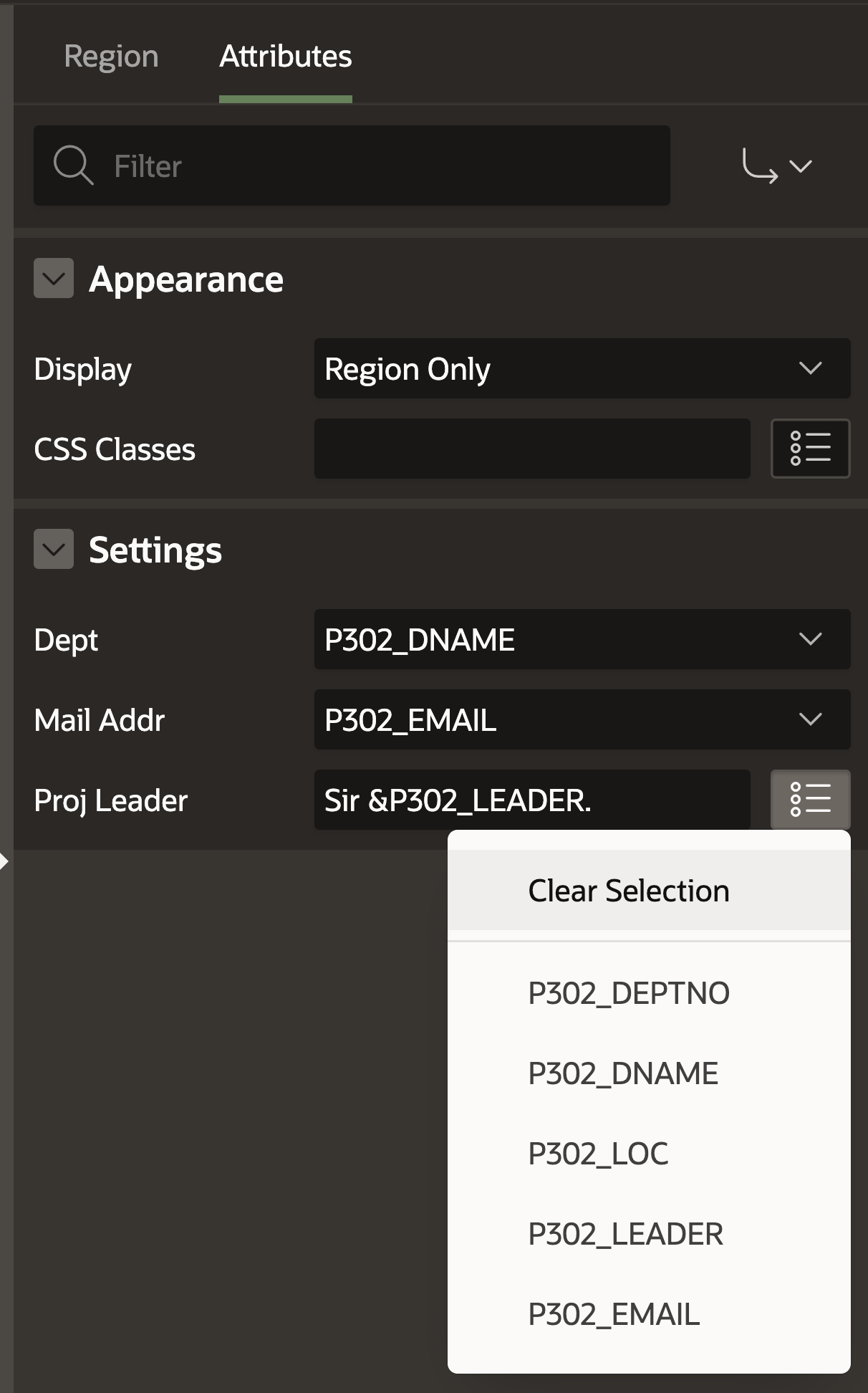
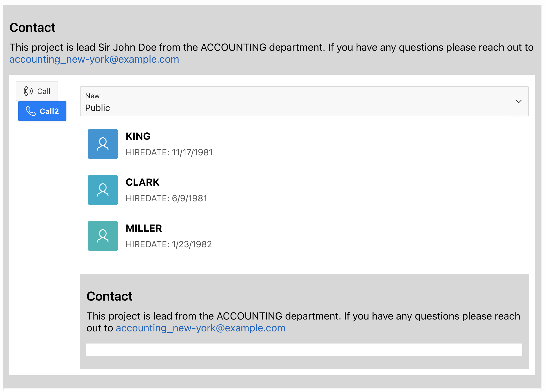
Use Case 2: Content depending on Page Items
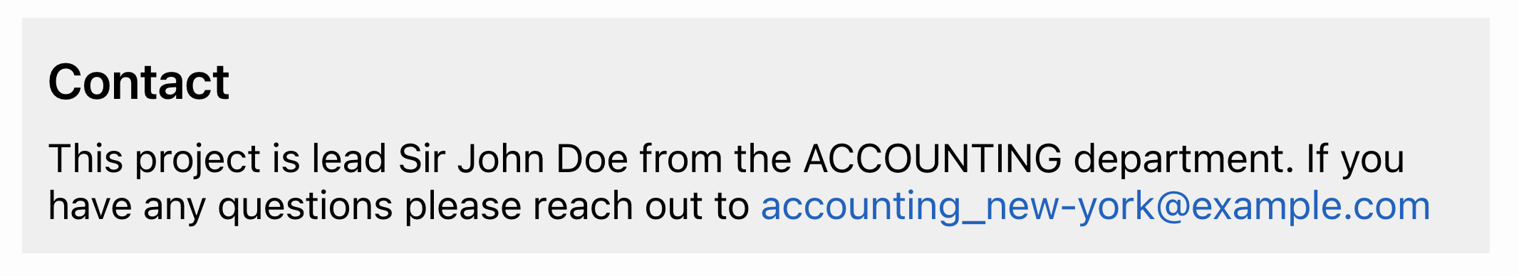
#You can still use attributes. This allows you to rely on already-queried page item values. For a fictional project portfolio app, you might want to display contact information nicely.
<div id="#APEX$DOM_ID#">
  <h3>Contact</h3>
  <p>
    This project is lead #PROJ_LEADER# from the #DEPT# department. {if
    MAIL_ADDR/}If you have any questions please reach out to
    <a href="mailto:#MAIL_ADDR#">#MAIL_ADDR#</a>{endif/}
  </p>
</div>
If your attribute type is the default “Session State Value”, you get a select list with all page items. If you change this to “text,” you can actually type something in yourself and still reference page items with substitution strings, along with the quick pick list. Why is this not the default?
Normally, you could just set the HTML in a static region on the page. But with the template component, you can reuse this on multiple pages and applications.
Use Case 3: Composition (but with issues)
#With the {with/}...{apply TEMPLATE/} syntax and with slots, you can include other template components. This allows you to compose multiple components. APEX theme components utilize this to include avatars or buttons in the content row component. And useful is that you can still use avatars standalone.
But the region-only option comes with issues in that regard. You can only use a “Single” in an Interactive Report. And as you can’t say that a Region-only component should also be usable as a “Single” you have no way of using it in an Interactive Report. I think this is a shame and should be changed. So until then, I would actually rather use a Partial TC for composition.
Slots
#Trust me, slots are a killer feature. They allow you to put anything inside your template component. This is composition overload!
In the template component near the end, there is a new section called “Slots”. Let’s create a new one and only allow buttons in there. We can set our new slot as the default position. (Click to zoom in on the images.)
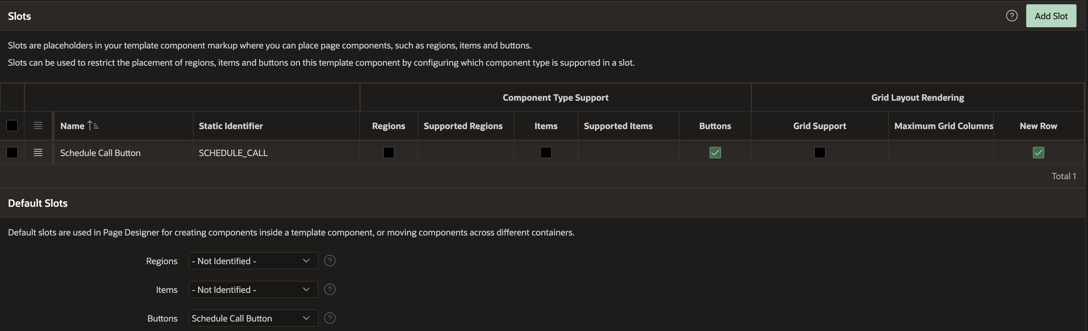
Like with action positions before, we can now add a slot to our template:
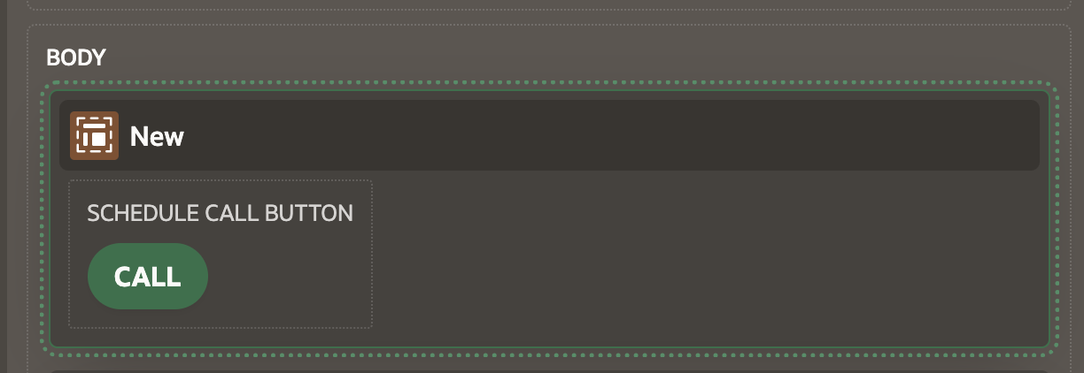
<div id="#APEX$DOM_ID#" class="uc-contact-banner">
  <h3>Contact</h3>
  <p>
    This project is lead #PROJ_LEADER# from the #DEPT# department. {if
    MAIL_ADDR/}If you have any questions please reach out to
    <a href="mailto:#MAIL_ADDR#">#MAIL_ADDR#</a>{endif/}
  </p>
  <div class="uc-contact-banner-footer">
    {if SCHEDULE_CALL/}#SCHEDULE_CALL#{endif/}
  </div>
</div>
In the page designer, we can now see a position where we can add buttons.
Let’s get more crazy and add another slot that allows any content.
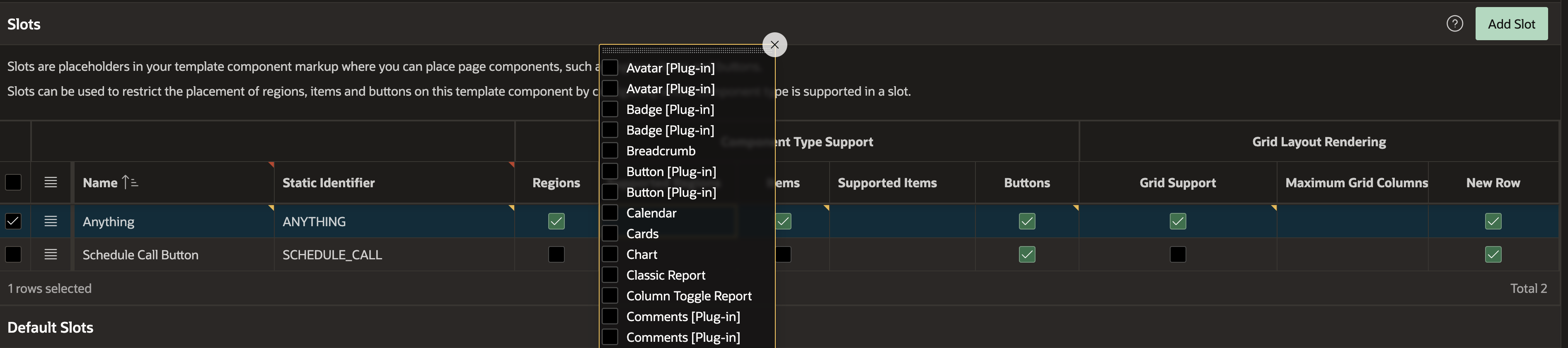
Note that we could also filter specific regions and item types to be allowed in the slot. This may also be useful for composing your own template components, where, for example, the project status list view template component only allows the project status template component to be included.
I also added the slot to the HTML template. In the page designer, I added an input, a “Content Row” theme component, and an instance of the same template component again (madness!) into the slot. And it works great!
Selection support
#For theme components like the “Content Row”, there is a new Row Selection option. The four options are: None, Focus Only, Single Selection and Multiple Selection.
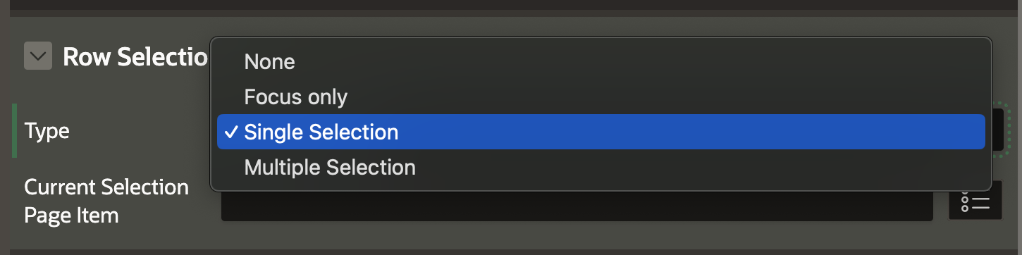
None does not add any click targets to the rows. Focus does this with a visible outline appearing when you click a row. I guess this is useful for adding your own click listeners.
For Single Selection, you get a new attribute called “Current Selection Page Item”. Whenever you click on a row, the value of the column defined as “Primary Key” gets set to the page item. This is super useful to just add a dynamic action on the page item change event and do something with the selected row or submit it to a process.
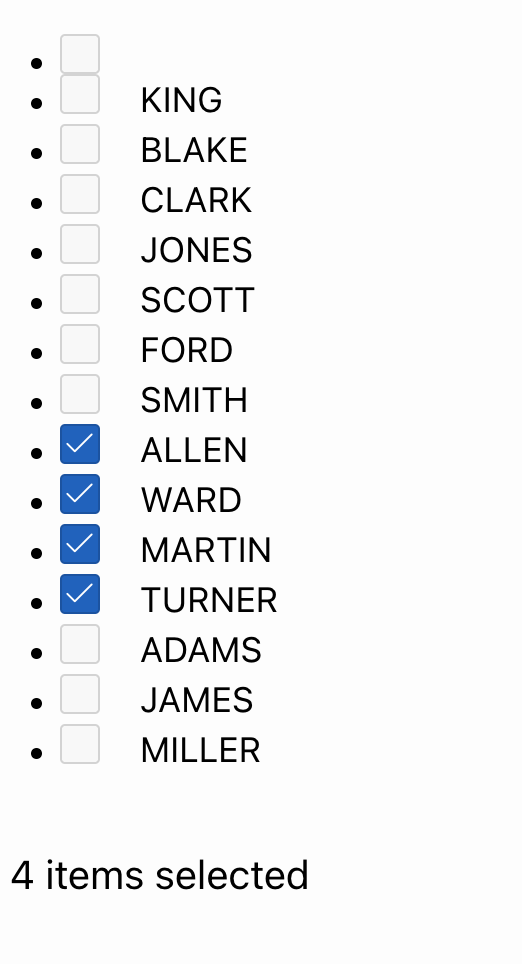
The last option, Multiple Selection, adds checkboxes to the rows. Again, the values of the primary key column get set to the page item delimited by colons. Another attribute appears in the page designer called “Select All Page Item”. You can again select a page item, but this has to be of the type “Checkbox”. When this is clicked, every (visible, not hidden by pagination) row gets selected. You can place that item on top of the region or even add a nice slot for it.
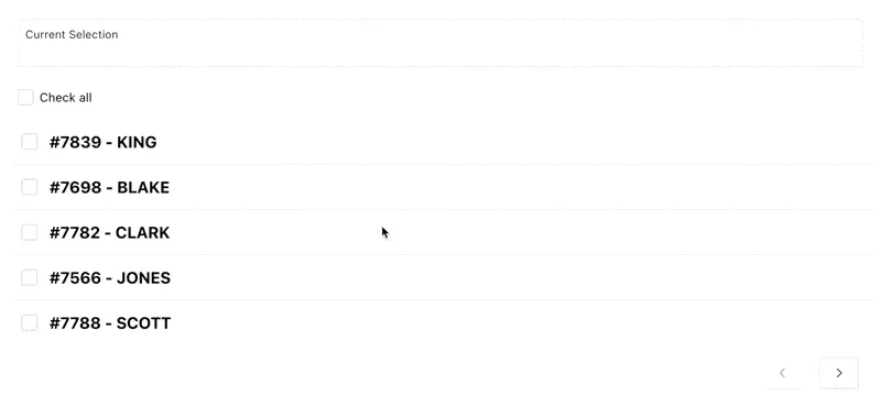
In the pagination section, the number of selected records is displayed. This is a nice touch. One issue is that if you miss the checkbox by a few pixels, you click on one row and thus deselect all others. In my opinion, in multiple selection mode, the checkbox should be the only clickable element in the row.
Interestingly, Hayden Hudson created the template component IR_Row_Selector last year, which is just a checkbox that you can then use inside an Interactive Report to select rows. Also, him on the APEX dev team, I have a guess who is behind this change. Thanks; I like it very much!
Add selections to your own template components
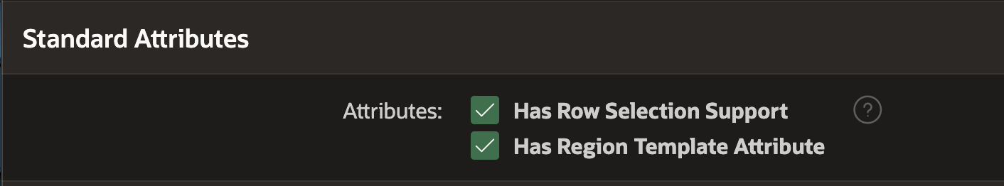
#As this won’t work with a “Region only” template component, I created a new one as Single and Multiple. The template for it is just a text attribute, and this selection div based on the APEX$SELECTOR attribute I copied from the content row component.
<div class="u-flex">
  {if ?APEX$SELECTOR%assigned/}
  <div class="t-ContentRow-selection">#APEX$SELECTOR#</div>
  {endif/}
  <div>#TEXT#</div>
</div>
Additionally, we need to check “Has Row Selection Support” in the standard attributes.
Now everything magically works on our own template component.
(In a previous version of this article, I had a bug resulting in the checkboxes for multiple selection not showing up. Thanks Tim for pointing it out!)
My first impression of APEX 24.1
#Template Components
#I am pleased with the improvements to Template Components. The region only is a useful addition; slots are the killer feature, and I will solve letting users select rows with the content row theme component with the checkbox in the future.
Summarized, these are my issues with Template Components in 24.1:
- You should be able to make a region-only component also usable as a single.
- The default attribute type for attributes should be text, not session state value.
- Missing the checkbox in the row in multiple selection mode should not deselect all other rows.
AI
#But 24.1 was mostly about AI, at least from the marketing point of view. I have to say, the features didn’t knock me off my socks. SelectAI was shown before, and it was clear that creating new pages is something that LLMs can do easily. Integration with LLM providers is something we have seen in the community for some time already.
I would have rather seen AI brought to end-users. The end-user wants some filters and highlights for an Interactive Report? Just describe them, and boom, there is a new private report saved.
Or even better, “Show me a dashboard of the earnings of the last quarter. I am curious to see the weakest-performing products and the ones with the highest growth. Show me any anomalies related to past quarters.” And then APEX would ad-hoc generate a dashboard with tables and charts without having to create a new page with regions.
Data scientists have been working with Jupyter Notebooks, etc., for quite some time now, where you just provide them with access to data and they can do their own analysis. I think this is something APEX should cover as well. I know this is a big ask, but this is my vision for being the ultimate data application platform.
The rest
#Other than that, I am not overwhelmed by the other new features. Select One and Select Many are confusing, as we now have two more options next to Select Lists, Popup LOVs and Comboboxes. I haven’t warmed up with Workflows yet, but their changes sound useful. I have no real use for Component Groups and Working Copies, as I mostly work alone or in small teams. The Document Generator seems nice for small use cases but is nowhere near AOP in functionality.
Other than that, these rather small changes are nice to have:
- Auto dismissal of success messages
- Unlimited Attributes for Plug-Ins
- File download Dynamic Action
- Button processing animation on click
- Search improvements with Oracle TEXT fuzzy and proximity search
- Dynamic Action “input” event as an alternative to change
- New Font APEX Icons
Please remember that this is my personal first impression and opinion. Of course, this could be different for you. I am looking forward to hearing your thoughts on the new release.