APEX: Highlight important values in tables with chips
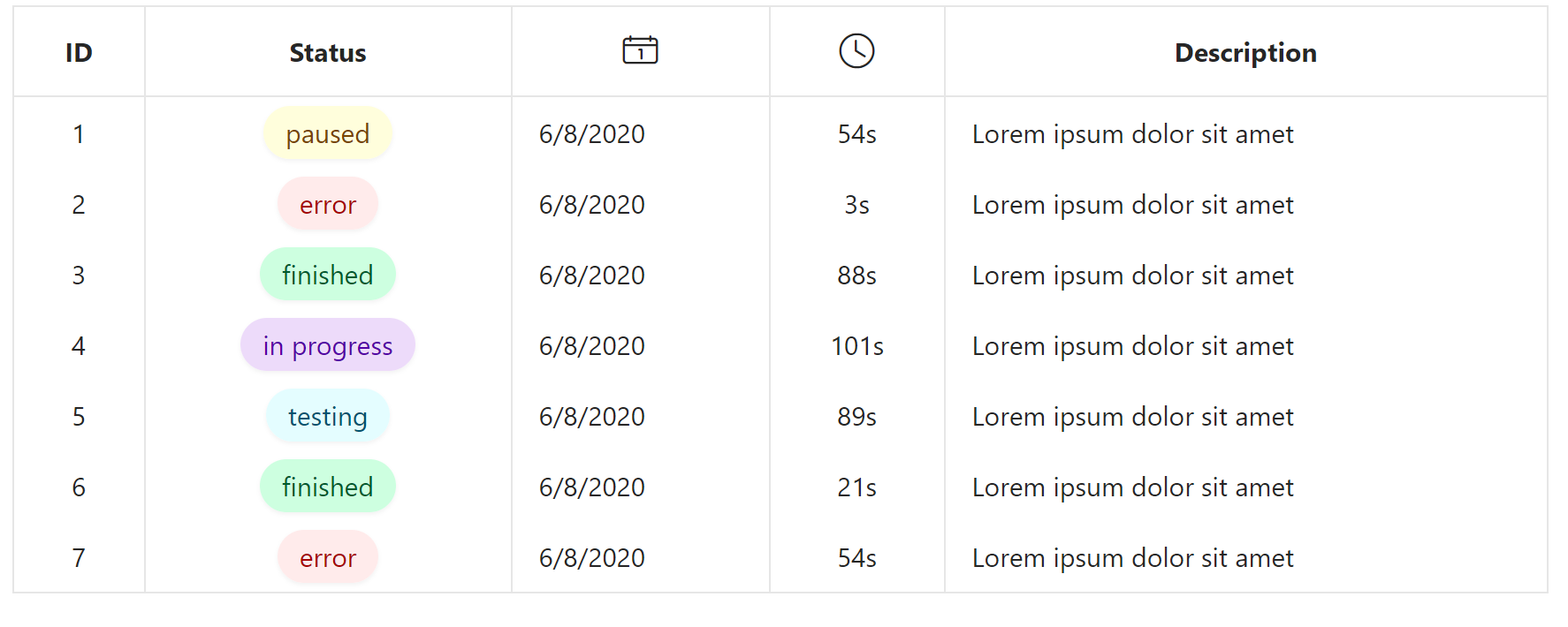
While tables are really good at structuring data, they don’t give hierarchy to the information. Some columns are more important than others, so the user should be able to easily scan the data to quickly find needed entities. One way to highlight the values of a column is by using color to underline for example a status of a dataset. How it looks is shown below:
| Variant | With Bullet Symbol |
|---|---|
| primary | • lorem ipsum |
| success | • lorem ipsum |
| warning | • lorem ipsum |
| danger | • lorem ipsum |
| purple | • lorem ipsum |
| pink | • lorem ipsum |
| orange | • lorem ipsum |
| teal | • lorem ipsum |
These colored pills are called chips and they first caught my attention inside the Material Design Guidlines by Google. I think they are a good approach to highlighting values because of their minimal look and the ability to also transfer meaning by the chosen color. Similar to APEX alerts, red can be used for an error status and green for a successful state. Using a light shade of the color as the background and a darker one as the text color is also used in Microsoft Excel and looks really clean in my opinion.
You can implement these chips in your application too with tiny effort by adding an HTML-Expression column inside your report. In there you can add a span element with the class “chip” which adds the styles relevant to all variations like the shadow or the rounded shape. The second class used is the chip-variant. For a warning status, I used “chip-warning” as a class but you can change the class names. Inside the span, you can display any text you want.
<span class="chip chip-&STATUS.">&STATUS_TEXT.</span>After that, you need to add the actual CSS-Styles for the classes to the page. The ones I used are listed below but you can of course modify them as you prefer. Keep in mind that a lighter text color might look nicer but isn’t as accessible as darker ones. The text-color in the styles below all have a AAA contrast-ratio to the background.